WORK

Saturday, December 31, 2011

PARIS 6: HANDEL-HALVORSEN PASSACAGLIA

SAINTE-CHAPELLE AT NIGHT
'ARCHITECTURE IS FROZEN MUSIC' - GOETHE
The cathedral of Sainte-Chapelle in Paris is arguably one of the world's greatest musical venues. It is also one of the oldest, most compelling and most intimate settings in which to hear and see a performance. We had the good fortune to experience a recent performance of the Handel-Halvorsen Passacaglia in the sanctuary itself. While the video is brief and imperfect, I hope it will inspire you to listen to other recordings of this magnificent piece.

Click here to see video.


Saturday, November 5, 2011

PARIS 5.


E.DEHILLERIN: utensiles de cuisine, 1er


PAPER CLOTHING (DISPLAY ONLY!) 4eme


LES POMPIERS AT WORK

Tuesday, October 25, 2011

PARIS 4.

MORNING LIGHT - rue des Francs-Bourgeois


COURTYARD - rue de Sevigne

AFTERNOON DRAWING SESSION - RADISHES


BALCONY APERITIF

WARM LIGHT - TIMBERED CEILING  - rue de Rosiers

Tuesday, October 18, 2011

PARIS 3.

ENTRĂ©E DES FOURNISSEURS: 4eme.  


COURTYARD BEHIND PLACE DE VOSGES


TYPICAL SCENE ACROSS THE RUE

Monday, October 17, 2011

PARIS: 2.

FLOWER SHOP RUE DES ARCHIVES 4eme
AGNES b. RUE DU MARSEILLE 10eme
BREAKFAST CHEZ MOI 4eme
PAIN A LA FARINE DE MEULE 10eme: BEST BOULANGERIE


Sunday, September 4, 2011

PARIS: 1.

PHOTOS: KATHLEEN WILLS
I awoke this morning to the liberating sound of seagulls. For a long moment, in my travel induced state, I was confused. At home, it was a familiar wake up call, yet I was quite sure I was no longer in close proximity to Lake Michigan. Eyes still closed, a subtle aroma wafting through the shuttered windows from somewhere across the white stuccoed, metal-roofed courtyard. Fresh air...bread...Eyes wide open now, low light filtering through the ornate iron balcony, strong geometric shadows on the adjacent wall...the chorus of church bells. All this brought me fully to my senses. Paris! We'd made it.

I could go on (and will, to be sure), expounding on the reasons why this is a place worth adoration, why I am ecstatic that we are able to finally realize the dream of spending a significant amount of time here, but at the moment, there are croissants and coffee to be had!


Sunday, July 31, 2011

STONE

Photo in Gordes, France by Kathleen Wills
I seem to be obsessed with stone. In all it's forms - limestone, granite, pietra cardosa... I am especially enthralled when it is used as a building material in the area from whence it came. Such as in this photograph from a small hilltown in southern France, Gordes. The limestone is ubiquitous in this region as it is the material that the mountains and hills are comprised of. Thus, when it is used as a building and paving material, it appears as if the landscape and structures are one; the houses grow up out of the land. The pale, sunwashed, organic uniformity of the stone combined with the cool, linear quality of the door in a complimentary color are absolutely sublime. Simple, honest, straightforward.

Would you agree? Feel free to contribute your thoughts, ideas and photos of similar uses of stone.

Wednesday, July 6, 2011

PROGRESS OR RUIN? The transformation of the tiny French village, Lacoste, by Pierre Cardin

photo of Lacoste by Adrian Gaut
In the middle of the french countryside, little more than an hour's drive from the Mediterranean coast, lie numerous, ancient hilltowns. Lacoste, perhaps the smallest of these, remained largely untouched for ages until fashion designer, Pierre Cardin, recently decided to invest 30 million euros into purchasing and restoring many of its buildings - including the chĂ¢teau of the notorious Marquis de Sade. The locals are not happy.

TONY PERROTTET writes in the WSJ article (link below):

"Since his arrival in Lacoste in 2001, Pierre Cardin has done his best to convert this outpost 25 miles east of Avignon into a "Saint-Tropez of culture," opening gallery spaces, a cafe-restaurant, a grocery store and an array of renovated guesthouses and apartments that will begin taking guests this summer. The cornerstone of his vision is the annual Lacoste Festival, held every July in memory of the Marquis de Sade, who was himself a maverick of the arts.

Not everyone in Lacoste has been thrilled by Cardin's new vision. His accelerating real-estate grab raised the ire of the left-leaning villagers, who had a Communist mayor for five decades after World War II. They vocally objected that his many acquisitions—Cardin often bought houses at up to triple market rate, even when they were in decay or ruins—were depopulating the village and stripping its rustic Provençal character. Accusing him of behaving like an arrogant feudal seigneur along the lines of Sade himself, many locals boycotted his cafe, boulangerie and souvenir store, all to the delight of visiting French newspaper and television reporters."

Read more about this story on the clash of culture and viewpoint: http://online.wsj.com/article/SB10001424052702304186404576388143793160396.html#ixzz1RL66nhtN


Progress or ruin? - We'd love to hear your comments!

Wednesday, June 8, 2011

MARIO BOTTA: BERG OASE IN AROSA, SWITZERLAND

BERG OASE WELLNESS CENTER AND SPA, AROSA, SWITZERLAND
As promised, more on Mario Botta... This, the interior of the Berg Oase Wellness Center and Spa in Arosa, Switzerland. Another incredibly simple yet inspiring use of material and form.

We'd love to hear what you think of Botta's work. Send us a comment below...

MARIO BOTTA: SFMOMA

SKETCH BY MARIO BOTTA

FACADE DETAIL
A recent trip to San Francisco brought the immense pleasure of seeing the SFMOMA, designed by Swiss Architect Mario Botta, whose work we love for its purity, simplicity, restraint and logic. A common material, brick, is used in varying directions and orientations to create pattern and texture. The additional use, in relatively small proportion, of white and black granite creates counterpoint.

Botta's work is genuinely beautiful in an awe-inspiring sense; combining grace, humility and real physical presence. 

More on Botta's work to follow...


Monday, May 30, 2011

SAN FRANCISCO

For someone who hasn't spent much time on the West Coast but is anamored with dramatic landscapes, northern California seems a good place to find inspiration. This photo was taken on an early morning walk on a hillside of a bedroom community of San Francisco. It could just as well have been southern France with billowing ochre grasses and deep green pines...

Tuesday, May 24, 2011

SUBTLETY

While on the subject of white and neutrality as an interior theme (see last post), it seems appropriate to also consider subtlety, or lack thereof.  In our culture we are constantly accosted with more information than we are able to or care to absorb. Complexity rules. Some, I included, still believe in the "less is more" philosophy. This photo, again from CotĂ© Bastide, exemplifies the idea that, when considering elements (line, color, form) for inclusion in a design, often, one change is enough. In this case, it is an embossed pattern which defines the uniqueness of this product. Someone made the decision that this was enough. We appreciate that. Your thoughts??

WHITE

Now that it's finally spring, (and the getting there took forever!) white, spare interiors once again become incredibly appealing as a backdrop to the color outside. A case in point is CotĂ© Bastide, the French housewares company, which embodies this philosophy fully (and inspires our work often). Here is a photo of theirs that we wanted to share to exemplify this point of view. We love the natural linen combined with white walls and an aged wood, wide-plank floor. Of course, the early morning light is lovely as well. Are you similarly drawn to this type of space? We'd love to hear your thoughts on what makes it so for you.

Friday, April 1, 2011

INDUSTRIAL TABLE

This coffee table is one of our recent projects at Kathleen Wills Design. Our client was interested in creating a one-of-a-kind industrial style piece for her living room, so we designed this coffee table featuring antique gurney casters and three-inch thick wood planks salvaged from the Gibraltar School in Detroit. The rough surface texture of the wood, replete with sawmarks and nail-holes, was left intact, and the steel frame has been hand buffed for a matte finish. In a way this table could be seen as an expression of our earlier post about the Detroit renaissance and industrial chic.

Sturdy enough for a dance party, this table only improves with each dent it acquires. Throw down a cup of coffee without a coaster, mix up a few margaritas without worrying about spilling - this table will probably outlive all of us.


It's not yet available on our website, but if interested, please contact us!

Saturday, March 19, 2011

The Weathered Palette

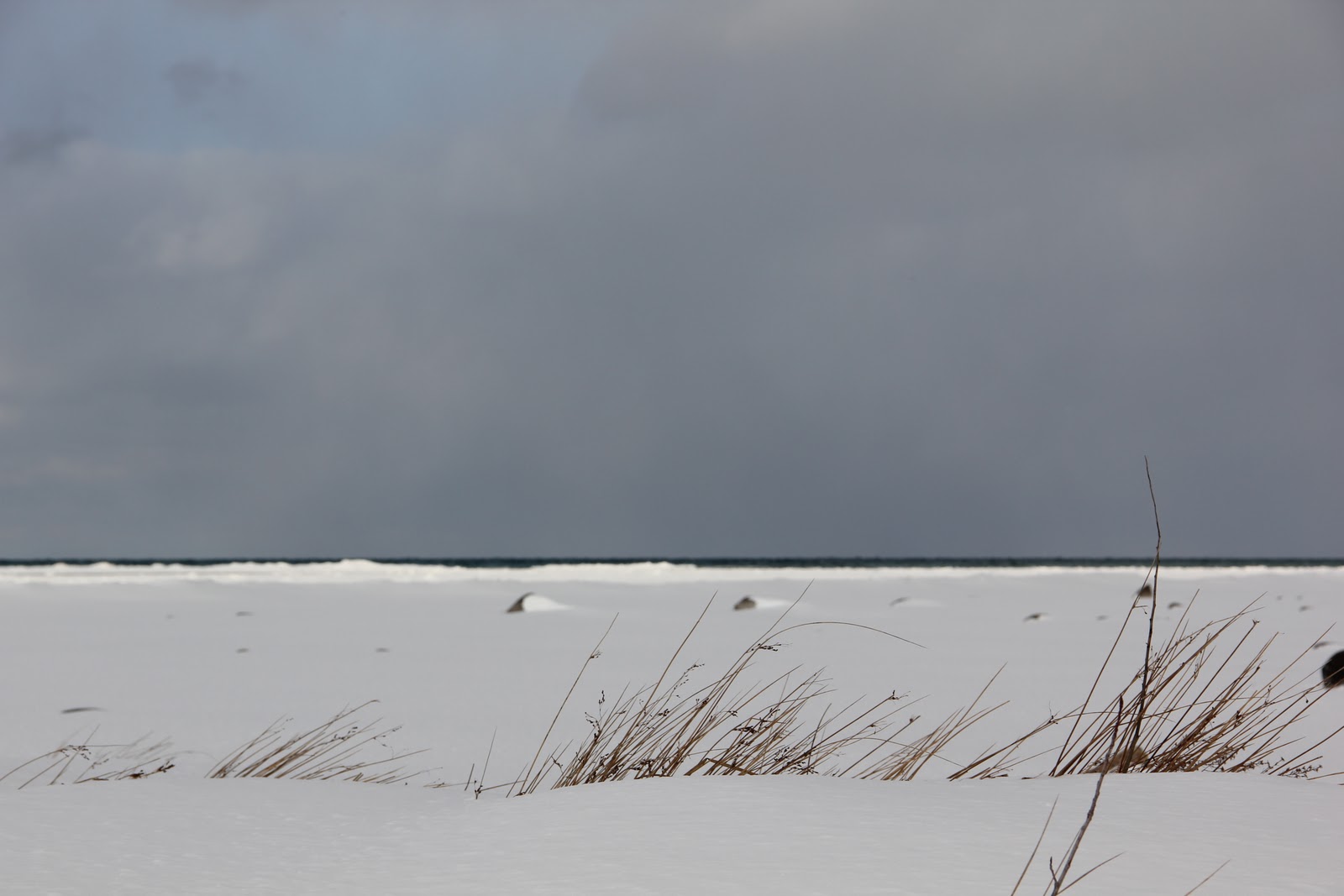
 These are a few photos from a recent expedition around Leelanau County, in northern Michigan. It's sort of funny to see this part of the country in mid-March, because it is neither the sunkissed summer season when harassed Detroiters flock northward by the thousands, nor the picturesque white Christmas season. It's the way a resort town looks in the sort of in-between times. It's like catching a glimpse of the fairgrounds after all the tents have been taken down, the horses have gone home, and all that's left of the ferris wheel is a twisted shard of iron. There's a sort of forlorn beauty in this abandonment, which isn't really loneliness but a kind of hibernating expectation. The photograph at the top is actually the Leland township jail - kind of what would happen if Edward Hopper designed Martha Stewart's incarceration. The second photo is the Lake Michigan shoreline - usually dotted with parasols and kids playing frisbee, but looking in this shot like the North Sea.

Tuesday, March 15, 2011

Conceptual Design Assignment

I'd like to change direction and stimulate dialogue on a conceptual piece by one of our firm's interns. The design assignment was to create a lampshade out of a fixed square footage of watercolor paper. I think this piece is particularly interesting because it marks a departure from the style our firm generally works in - our pieces are usually driven by functionality or historical reference, whereas this piece is a deliberate evocation of the natural world. The designer was interested in exploring light and its diffusion, and took as a starting point a childhood experience in which he had clambered through shards of ice strewn by a passing ice-breaker on Lake Michigan. Like ice, the material used is transparent enough that a certain degree of light is able to shine through. However, its most interesting effect is the way in which it scatters light from its reflective surfaces into fascinating patterns on the wall and ceiling.

We'd love to hear feedback on this concept! Please feel free to comment below.

Monday, March 7, 2011

Photography as Painting


Photographer Lynn Geesaman recently caught my eye with her painterly and ethereal depictions of gardens and natural landscapes. This particular photograph of a live oak at a Louisiana plantation evokes the kind of psychological drama she has come to be known for. I'm reminded of another favorite photographer, Sally Mann, whose love of similar landscapes produced the collection "Deep South."


Of all the places to which I've traveled in America, the deep south seems the most stirringly real and unreal at the same time. Southern cities such as New Orleans and Savannah evoke this unreal, hazy, dreamlike quality born of deep history, misty weather, and tortured treescapes. Lynn Geesaman captures this imaginative world both through the images she chooses to capture and through her use of diffusion techniques that evoke the shifting qualities of light and the landscape.

Thursday, February 24, 2011

Match Gabriella Flatware

As promised, more about a favorite company - MATCH. Their pewter products are handmade in northern Italy. Our first find years ago was a candleabra (see previous post). Since then, when given the opportunity to furnish a home we've designed, this is a company we look to for high quality tableware. There is something special about products with clean, architectural lines that retain the mark of the hand that made them. We'd love to hear your comments and suggestions of other companies with similar qualities.
http://www.match1995.com/pewter.html

Pond Hockey

The photos in this album probably induce more homesickness than any I've taken recently. Ellis is playing ice hockey on the frozen Lake Michigan amidst a sky worthy of a John Constable painting. I was raised with the sport, (my father played goalie until the age of 86) so perhaps I'm a bit biased, but I feel that something of the core of the American North is wrapped up in its bold lines and immediacy. Our family immigrated from Belgium and England to Michigan's Upper Peninsula to work in the iron mines, trading poverty in the old world for poverty in the new. My father would always wear these LL Bean boots while shoveling the driveway or getting a rink ready for a neighborhood game of pond hockey.
Now Ellis has his own pair and is down on the lake playing after school. Though I will betray a bit more regional bias, I've come to feel that the austere winters of the north have done a lot to influence my design aesthetic. When I worked with Dansk International Designs, our products were expressly influenced by the clean lines of Scandinavian design. Later, working in architecture and product design, we created simple board and batten home furnishings based on the brightly colored seaside homes of Norway and Sweden, and built cabinetry of white Baltic Birch. Since these experiences, I've inevitably kept these influences present in my work. It's really about an emphasis on elementality. Nature gives us the sky, the water, the trees, and the ice. This is the palette. What we create emerges from who we are.

KWD Interiors

It occurs to me that it might be good to post a little of our studio's work on the blog from time to time! This still life is from an interior by Kathleen Wills Design for a project on the Old Mission Peninsula. The candelabra is pewter, made in Italy by Match, - found at Barneys New York. (Their pewter and stainless flatware is lovely as well - see next post.) The loveseat is slipcovered in cream canvas from Crate and Barrel - perfect for a beach house with summer coming (we hope)! Additional interiors and original furniture can be found at www.kathleenwills.com

Saturday, February 12, 2011

Imported From Detroit

As someone born and raised in Michigan, the poetically tragic history of Detroit has always been to me a fascinating and painful topic. Detroit was once the "arsenal of democracy" and the third largest city in America. Today, it plays host to rampant crime, struggling industry, and boasts less than half of the population it had in 1950. Half.


In any case, this is why the Chrysler ad that aired during the Superbowl is worthy of comment. Rather than attempting to portray Detroit as a quintessential American city or trying to stoke consumer allegiance by emphasizing the patriotism of buying domestic cars, Chrysler does exactly the opposite - it emphasizes Detroit's hardships and disconnect from the rest of America as the very flames that allow it to forge excellence in art and industry. The advertisement is littered with phrases like "the hottest fires make the hardest steel" and "we're from America, but this isn't New York City." Detroit's rough edges and its intimidating mystery are no longer drawbacks - they are in fact its main selling points. 


Perhaps I find this topic interesting because design and marketing are concerned with the portrayal of an image. What is Detroit's form? How will it be cast in the next century? Will it make a difference if people respect Detroit for what it is - a tough town that is finding a non-standard way to make it - rather than expecting it to be a safe, all-American "Renaissance" center as developers had imagined?


Personally, I'm conflicted about the answers to these questions. I would love to hear your thoughts.

Exhibit A: Motion

This is my son Ellis on the swing at Branford college. There's not a whole lot to say about it except to point out that unself-consciousness is often the first step in eleg-ance, whether in dance, design, or even in social interaction.

This swing has been a fixture of the Branford courtyard at Yale for at least a hundred years, and countless families have cute photos of their children on the swing stretching back as far as the 1920s. I've seen twin photographs on coffee tables of someone on the swing as a child and as an undergraduate.

But the salient feature of most of these portraits has been their formality. Girls sit chastely on the swing, boys pose gravely with one hand on their pocket. And into this arc of history of which he is totally ignorant, Ellis strides boldly and gives us this.

I suppose it's safe to say that the swing is best when its form follows its function.

Saturday, February 5, 2011

Function is Form

You know you have achieved perfection in design, not when you have nothing more to add, but when you have nothing more to take away.
- Antoine de Saint Exupery


This photo was taken in a snowstorm in Leland, MI, about 2 miles from the Lake Michigan shoreline. The simple barn in the foreground is a striking example of the design principle that form must follow function. In an age where architecture is informed more by whim than by intention, it's useful to remind ourselves where style originates.


The picturesque lines of this structure, so often copied in later architecture, derive from its purpose as housing for livestock and storage for feed. The gambrel roof, seen here from the side, was pioneered to permit more space for hay to be stacked in the upper floors. The understated, small windows allow ventilation while preventing too much heat loss in the winter season.


How refreshing to come upon a building that is nothing more and nothing less than it needs to be. Design is at its most honest when it serves its purpose directly and efficiently, and this photograph bears witness to this principle.

Thursday, January 27, 2011

Water and the Cityscape

This is a photo from a recent trip to Prague, and the thought-provoking thing about it is the way that water functions in defining urban space. The public part of a community - its streets - are in a way a sort of negative space - they receive their identity by being the little ribbons of non-private property that spider-web through the cityscape. If this is their theoretical identity, then their physical identity is similar - they gain definition from the walls, plazas, and facades that rise up on either side. A street needs to be contained to make pedestrians comfortable. In the same way that diners will choose the corner booth over a center table, people are instinctively more comfortable in a defined street space built to a human scale. Perhaps it creates a sort of safety. Perhaps its coziness evokes the womb. But regardless, this principle in a large way explains the death of the American landscape - as freeways were built through communities like Detroit and New Haven the streets ceased to be human-scaled and the space ceased to be defined as delimiting buildings moved further and further back to accommodate massive parking lots. Cities were no longer cityscapes built for people but moonscapes built for the automobile. So maybe that's one reason so many tourists flock to the old town of Prague - to reclaim the feeling of comforting enclosure that can be experienced in its narrow streets.


This concept of delimitation is part of what's so important about water. The city of Prague is built on a series of bends in the Vltava river, so each riverbend forms a different community as the water effectively delimits the neighborhood from its surroundings. Without these natural frames, Prague's micro-communities would have less individual identity. Water is important because of its effect on the eye - ironically it is both limiting and freeing as it walls off spaces and allows room for the eye to stretch.


Incidentally, this photo was taken during a spring flood, and the island on which I was standing was quickly thereafter engulfed by the waters of the Vltava. I'm not exactly sure what implications that has for "defining space." Consider it food for thought.

Monday, January 24, 2011

C L O U D S


John Constable's cloud sketches, done in the early 1820's in England, are among my favorite works of art (below - and many more to come). He observed and recorded one of the most transient subjects - the sky, notating the precise details of time, temperature and wind direction. The colors are gorgeous and earthy, and the brushstrokes loose and spontaneous.


It hardly compares, but when the light and conditions are just right, it's almost possible to capture an image over the lake that comes close (below, 2). I guess the onus is on me to take a momentary breather from driving kids to lacrosse practice and piano lessons and paint. There's probably an important lesson to be learned from Constable. He didn't have the luxury of seeing a beautiful thing and putting it off. If the clouds were right, they were right, and he had to paint them then and there. There's not really an excuse for putting off your art - you can always procrastinate by the insidious method of "I'll do this once I've finished paying bills / doing housework / other mundane chores", but the truth is that this moment never comes. So there's a New Year's resolution - to prioritize art over procrastination. The dishes will wash themselves for now.