WORK

Monday, March 7, 2011

Photography as Painting


Photographer Lynn Geesaman recently caught my eye with her painterly and ethereal depictions of gardens and natural landscapes. This particular photograph of a live oak at a Louisiana plantation evokes the kind of psychological drama she has come to be known for. I'm reminded of another favorite photographer, Sally Mann, whose love of similar landscapes produced the collection "Deep South."


Of all the places to which I've traveled in America, the deep south seems the most stirringly real and unreal at the same time. Southern cities such as New Orleans and Savannah evoke this unreal, hazy, dreamlike quality born of deep history, misty weather, and tortured treescapes. Lynn Geesaman captures this imaginative world both through the images she chooses to capture and through her use of diffusion techniques that evoke the shifting qualities of light and the landscape.

Thursday, February 24, 2011

Match Gabriella Flatware

As promised, more about a favorite company - MATCH. Their pewter products are handmade in northern Italy. Our first find years ago was a candleabra (see previous post). Since then, when given the opportunity to furnish a home we've designed, this is a company we look to for high quality tableware. There is something special about products with clean, architectural lines that retain the mark of the hand that made them. We'd love to hear your comments and suggestions of other companies with similar qualities.
http://www.match1995.com/pewter.html

Pond Hockey

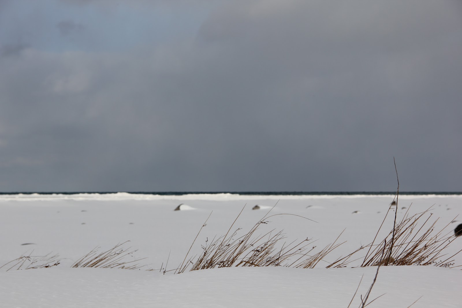
The photos in this album probably induce more homesickness than any I've taken recently. Ellis is playing ice hockey on the frozen Lake Michigan amidst a sky worthy of a John Constable painting. I was raised with the sport, (my father played goalie until the age of 86) so perhaps I'm a bit biased, but I feel that something of the core of the American North is wrapped up in its bold lines and immediacy. Our family immigrated from Belgium and England to Michigan's Upper Peninsula to work in the iron mines, trading poverty in the old world for poverty in the new. My father would always wear these LL Bean boots while shoveling the driveway or getting a rink ready for a neighborhood game of pond hockey.
Now Ellis has his own pair and is down on the lake playing after school. Though I will betray a bit more regional bias, I've come to feel that the austere winters of the north have done a lot to influence my design aesthetic. When I worked with Dansk International Designs, our products were expressly influenced by the clean lines of Scandinavian design. Later, working in architecture and product design, we created simple board and batten home furnishings based on the brightly colored seaside homes of Norway and Sweden, and built cabinetry of white Baltic Birch. Since these experiences, I've inevitably kept these influences present in my work. It's really about an emphasis on elementality. Nature gives us the sky, the water, the trees, and the ice. This is the palette. What we create emerges from who we are.

KWD Interiors

It occurs to me that it might be good to post a little of our studio's work on the blog from time to time! This still life is from an interior by Kathleen Wills Design for a project on the Old Mission Peninsula. The candelabra is pewter, made in Italy by Match, - found at Barneys New York. (Their pewter and stainless flatware is lovely as well - see next post.) The loveseat is slipcovered in cream canvas from Crate and Barrel - perfect for a beach house with summer coming (we hope)! Additional interiors and original furniture can be found at www.kathleenwills.com

Saturday, February 12, 2011

Imported From Detroit

As someone born and raised in Michigan, the poetically tragic history of Detroit has always been to me a fascinating and painful topic. Detroit was once the "arsenal of democracy" and the third largest city in America. Today, it plays host to rampant crime, struggling industry, and boasts less than half of the population it had in 1950. Half.


In any case, this is why the Chrysler ad that aired during the Superbowl is worthy of comment. Rather than attempting to portray Detroit as a quintessential American city or trying to stoke consumer allegiance by emphasizing the patriotism of buying domestic cars, Chrysler does exactly the opposite - it emphasizes Detroit's hardships and disconnect from the rest of America as the very flames that allow it to forge excellence in art and industry. The advertisement is littered with phrases like "the hottest fires make the hardest steel" and "we're from America, but this isn't New York City." Detroit's rough edges and its intimidating mystery are no longer drawbacks - they are in fact its main selling points. 


Perhaps I find this topic interesting because design and marketing are concerned with the portrayal of an image. What is Detroit's form? How will it be cast in the next century? Will it make a difference if people respect Detroit for what it is - a tough town that is finding a non-standard way to make it - rather than expecting it to be a safe, all-American "Renaissance" center as developers had imagined?


Personally, I'm conflicted about the answers to these questions. I would love to hear your thoughts.

Exhibit A: Motion

This is my son Ellis on the swing at Branford college. There's not a whole lot to say about it except to point out that unself-consciousness is often the first step in eleg-ance, whether in dance, design, or even in social interaction.

This swing has been a fixture of the Branford courtyard at Yale for at least a hundred years, and countless families have cute photos of their children on the swing stretching back as far as the 1920s. I've seen twin photographs on coffee tables of someone on the swing as a child and as an undergraduate.

But the salient feature of most of these portraits has been their formality. Girls sit chastely on the swing, boys pose gravely with one hand on their pocket. And into this arc of history of which he is totally ignorant, Ellis strides boldly and gives us this.

I suppose it's safe to say that the swing is best when its form follows its function.

Saturday, February 5, 2011

Function is Form

You know you have achieved perfection in design, not when you have nothing more to add, but when you have nothing more to take away.
- Antoine de Saint Exupery


This photo was taken in a snowstorm in Leland, MI, about 2 miles from the Lake Michigan shoreline. The simple barn in the foreground is a striking example of the design principle that form must follow function. In an age where architecture is informed more by whim than by intention, it's useful to remind ourselves where style originates.


The picturesque lines of this structure, so often copied in later architecture, derive from its purpose as housing for livestock and storage for feed. The gambrel roof, seen here from the side, was pioneered to permit more space for hay to be stacked in the upper floors. The understated, small windows allow ventilation while preventing too much heat loss in the winter season.


How refreshing to come upon a building that is nothing more and nothing less than it needs to be. Design is at its most honest when it serves its purpose directly and efficiently, and this photograph bears witness to this principle.

Thursday, January 27, 2011

Water and the Cityscape

This is a photo from a recent trip to Prague, and the thought-provoking thing about it is the way that water functions in defining urban space. The public part of a community - its streets - are in a way a sort of negative space - they receive their identity by being the little ribbons of non-private property that spider-web through the cityscape. If this is their theoretical identity, then their physical identity is similar - they gain definition from the walls, plazas, and facades that rise up on either side. A street needs to be contained to make pedestrians comfortable. In the same way that diners will choose the corner booth over a center table, people are instinctively more comfortable in a defined street space built to a human scale. Perhaps it creates a sort of safety. Perhaps its coziness evokes the womb. But regardless, this principle in a large way explains the death of the American landscape - as freeways were built through communities like Detroit and New Haven the streets ceased to be human-scaled and the space ceased to be defined as delimiting buildings moved further and further back to accommodate massive parking lots. Cities were no longer cityscapes built for people but moonscapes built for the automobile. So maybe that's one reason so many tourists flock to the old town of Prague - to reclaim the feeling of comforting enclosure that can be experienced in its narrow streets.


This concept of delimitation is part of what's so important about water. The city of Prague is built on a series of bends in the Vltava river, so each riverbend forms a different community as the water effectively delimits the neighborhood from its surroundings. Without these natural frames, Prague's micro-communities would have less individual identity. Water is important because of its effect on the eye - ironically it is both limiting and freeing as it walls off spaces and allows room for the eye to stretch.


Incidentally, this photo was taken during a spring flood, and the island on which I was standing was quickly thereafter engulfed by the waters of the Vltava. I'm not exactly sure what implications that has for "defining space." Consider it food for thought.

Monday, January 24, 2011

C L O U D S


John Constable's cloud sketches, done in the early 1820's in England, are among my favorite works of art (below - and many more to come). He observed and recorded one of the most transient subjects - the sky, notating the precise details of time, temperature and wind direction. The colors are gorgeous and earthy, and the brushstrokes loose and spontaneous.


It hardly compares, but when the light and conditions are just right, it's almost possible to capture an image over the lake that comes close (below, 2). I guess the onus is on me to take a momentary breather from driving kids to lacrosse practice and piano lessons and paint. There's probably an important lesson to be learned from Constable. He didn't have the luxury of seeing a beautiful thing and putting it off. If the clouds were right, they were right, and he had to paint them then and there. There's not really an excuse for putting off your art - you can always procrastinate by the insidious method of "I'll do this once I've finished paying bills / doing housework / other mundane chores", but the truth is that this moment never comes. So there's a New Year's resolution - to prioritize art over procrastination. The dishes will wash themselves for now.


L O L L

After many years of oiling our teak outdoor furniture and covering it in the winter to protect it from the elements, we ordered chairs and benches from Loll Designs. The design is simple, functional and comfortable, and it can be left outside in all weather, as you can see all too hilariously below. Not to mention it's made of 100% recycled materials. www.lolldesigns.com


Saturday, January 8, 2011